
carmine-cassie » blog » nasin sitelen kalama suwi
nasin sitelen kalama suwi
A cute system for sitelen pona names!
It feels like a rite of passage for toki pona speakers to, at some point on their learning journey, invent an unnecessary nimi sin, number system, date/time system, or something of that kind. I’m excited, four years into my toki pona journey, to finally become part of this tradition with nasin sitelen kalama suwi: a cute method for writing names in sitelen pona!
The Problem Space
Okay, first off, why am I doing this? What problem is there to be solved, what issue do I purport to take with the three big extant systems for writing names in sitelen pona? Let’s go through each of them, using "ma Sonko" as an example, in the lovely nasin nanpa font.
Classic-style:

The big friction points for me here are recall efficiency and space efficiency. For each letter, you gotta recall a whole word, then throw out most of what you’re recalling. Plus, the cartouche just takes up so much space! Also, this is less big of a deal, in part because I know some people love it, but having so many glyph choices for each letter kind of slows down writing with decision paralysis, and I get stressed when writing names of people or places, because what if I misrepresent them?
nasin sitelen kalama / Morae-based:

Okay I actually really like this system, it’s probably my favourite, and, like, I see it all the time so I imagine it’s many other peoples’ favourite too! Extracting morae out of words feels more intuitive than just the first letter, there’s less recalls involved - it reads way easier than the classic system. Still takes up a boatload of space, though!
nasin sitelen kalama pi linja lili / Tally marks:

Okay we are for sure more space compact now, I like that, but I don’t love this one aesthetically. If the tally marks are small, they’re less legible at smaller text sizes, and if they’re big, they look ike - just cause they’re such a high frequency pattern!
Exploring Alternatives
For a while, I liked the concept of just, popping Latin characters inside the cartouche. This one is like, fine - if you use half-width characters it’s pretty compact and it’s very fast to read so long as you’re familiar with the script. (Though if the name has an odd number of characters you can lose grid alignment.) At the same time, though, it feels a bit weird, like, if you’re going to all the effort of using sitelen pona, why are you stopping short and still resorting to Latin characters? Just a bit Latin-centric and not super aesthetic.

Also! Uh, okay, so I’m a bit anti-tokiponisation in writing. (It makes things ungoogleable, so people tend to include a footnote, so what’s the point- but I digress.) I usually don’t tokiponise when writing toki pona in Latin text, and I’ve previously toyed with the (slightly silly) idea of not tokiponising text inside sitelen pona cartouches. Naturally, just as we use endonyms, we’d use the source writing system.

What I like most here is the way that this more closely aligns with my experience of tokiponisation in spoken toki pona - you make an honest attempt to recall and pronounce the endonym and it gets sort of naturally squished to toki pona’s phonotactics because you’re code-switched in, right.
Naturally, though, not everybody knows how to read every writing system, so maybe we want to add a little something extra as a pronunciation guide? Maybe something like ruby characters/furigana? But now we’re back at square one, looking for a way to represent pronunciation!

An Example of Furigana/Ruby Characters
(The ruby characters are
the small Kana indicating pronunciation above the Kanji logograms.)
I briefly thought about just straight-up using hiragana for a furigana-type system, then somehow found myself looking at the results of the 2024 Toki Pona census, wherein I found that the phonemic orthography that was most well-known to toki pona speakers (behind the Latin alphabet) was not Kana, or Hangul, or Arabic, or Hebrew, but sitelen sitelen (A.K.A. sitelen suwi), at around 35%!
As you may know, sitelen sitelen is logographic, non-linear, and tends to look like a buncha little critters, but for writing names in cartouches, it has an abugida-type situation going on! Each syllable’s like a little guy, with the consonant forming the body, the vowel a facial feature, (like an eye or tongue), and coda ‘n’ represented by some little legs!
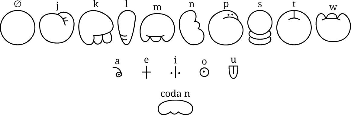
Initially, stuck in my furigana lens, I tried popping little sitelen sitelen characters as a pronunciation guide above a cartouche containing the endonym in the source language. It didn’t work out great - they’re a bit too high-detail for that small size, and how should you align them? But then it occurred to me:
nasin sitelen kalama suwi
What if we just put the sitelen sitelen inside the cartouche?
There are (understandably) very few sitelen sitelen fonts out there, and because of the high amount of detail in each character they tend to have pretty narrow stroke widths, so they don’t match up well with most sitelen pona fonts. But sitelen sitelen can happily lose some of that detail at smaller sizes, so I put together a quick set of sitelen sitelen syllable glyphs with a thicker stroke width:
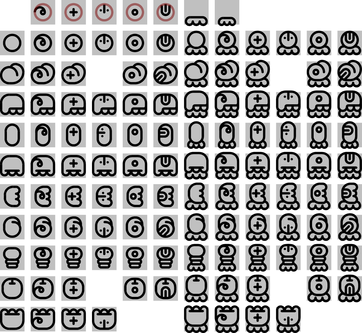
(I am by no means a type designer, but I did my best!)
nasin sitelen kalama suwi, then, is this: inside a sitelen pona name cartouche, spell the name using sitelen sitelen syllable glyphs. When paired with a monospaced sitelen pona font, they should be full-width, but in handwriting or proportional fonts, you can totally bunch them up a bit more, as is more typical for sitelen sitelen.
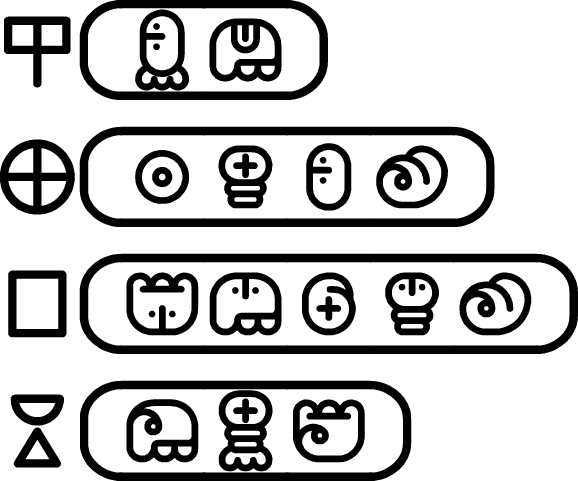
That’s it! Here's our "ma Sonko" example:

Time to Reflect
Is this system any good? Let’s analyse! It definitely does well with regards to my three largest problems with most sitelen pona name systems: it’s compact (exactly one character per syllable), fast to read (in that you’re not recalling full words and then throwing out most of that recalled info), and aesthetically it’s pona (not too visually noisy or biased towards the Latin script). Also, personally, I'm a fan of how there's one unambiguous way to write each name. Like, I think it looks really great, I like it a lot! Here are some more examples:
It is, however, like many similar tweaks to toki pona, unnecessary. nasin sitelen kalama is already great! It’s easy to encode, to write, to learn, and it’s already commonplace. I’m happy to let my little nasin sitelen kalama suwi fade away into obscurity, like every reddit post about a beginner’s excited nimi sin - I’ve had my crack at it!
o pona